r25.jpg)
Personal notes
|
|
||
|
Personal notes |
||
|
[Designing Pag-1]
|
|||||
|
Nowadays, the 45.000 tons of Michelangelo and Raffaello, may look to be few thing if compared to the modern cruise ships, as the Grand Princess of 130.000 tons. Or even if compared to other cruise ships which being of shorter length, they own a larger tonnage.
In reality this feature is obtained by some simple "tricks" in phase of designing.... In order to obtain the maximum tonnage size (the volume inside of the ship), the designers design very high ships and maximally exploit the height of the ship, extending all the decks long the full width of the hull, up to the upper decks. (Creating the "box effect" as I use to call it).
That's why it is easy obtain high tonnages on the nowadays cruise ships. For example the cruise ship Costa Victoria (built by the CR dell'Adriatico in Monfalcone) is 74.000 tons tonnage, even being 14 meter shorter and only 1,5 meter larger than Michelangelo or Raffaello.
These architectures imply that the gravity centre of the ships is naturally located higher. As naval experts say, these facts make the ships less safe in presence of strong storms or winds, and in case of sinking they would trend to overturn easily, due to the major trend to rotate of the high gravity centre. This excessive vertical development, was also one of the factors that in 1994 caused the overturning of the ferry boat Estonia, in Baltic Sea, where 1000 persons died.
Independently by this aspect, as our personal opinion, the ships built by this kind of designing result to be really ugly. We could no more define them as "ships", because basically they are nothing different than one floating rectangular holiday-villages, with one short prow added on their narrower side. Most of their internal volume is "wasted" in large empty spaces, often dominated by panoramic elevators, as it the ship would been built to be only a shopping center. Moreover, their interiors are designed on the style of Casinò / Luna Parks. The taste and refinement of the great liners of few ten years ago, are disappeared. Their lounges may look very sumptuous, but in reality they are made by cheap materials as well as also their crews are composed by low costs people. Further, the frenetic and "noisy" atmosphere aboard of the cruise travels have nothing in common with the atmosphere of relax and total fusion with sea that there were aboard the oceanic crossings aboard the big liners of few ten years ago.
|
|||||
| Grand Princess: one clear example of the trend of the modern naval architecture, more similar to floating hives. | |||||
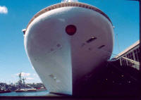
| One question.... prow or pan? | |||||
 |
|||||
|
|
|||||
|
|
|||||
|
|
Drawing by Giuseppe Fariello, Naples (Italy) |
||||
|
This is an indicative comparison between the Michelangelo and the cruise ship Costa Fortuna, that show how it is possible to show enormous tonnages for the modern cruise ships. The Michelangelo were 275,8 meters long, 31 meters width and measured 45.933 tons. The Costa Fortuna is 3 meters shorter than Michelangelo, 3 meters wider, but contains a volumetric space of right 105.000 tons, more than the double of Michelangelo. Because of this use of the physical dimensions, the modern ships give the idea to be "voluminous boxes" rather than really great ships. |
|||||
|
[Designing Pag-1]
|
|||||